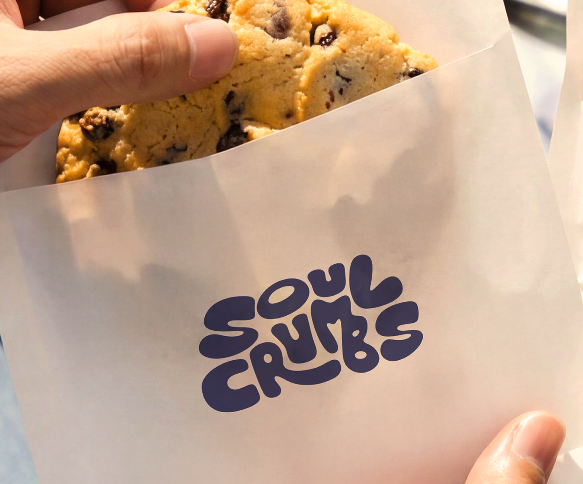
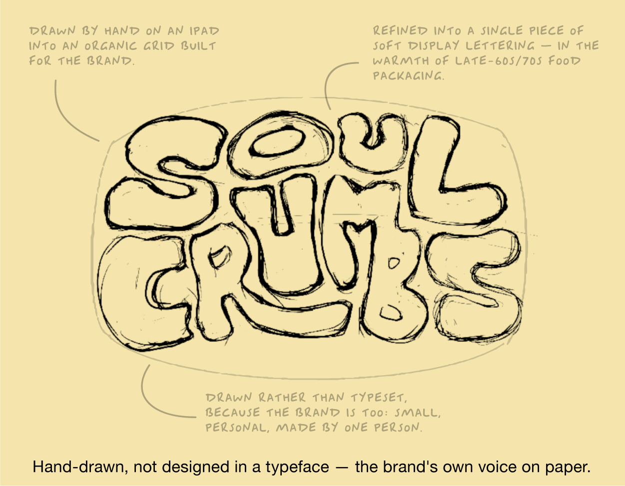
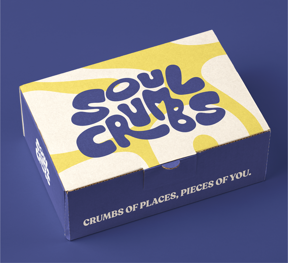
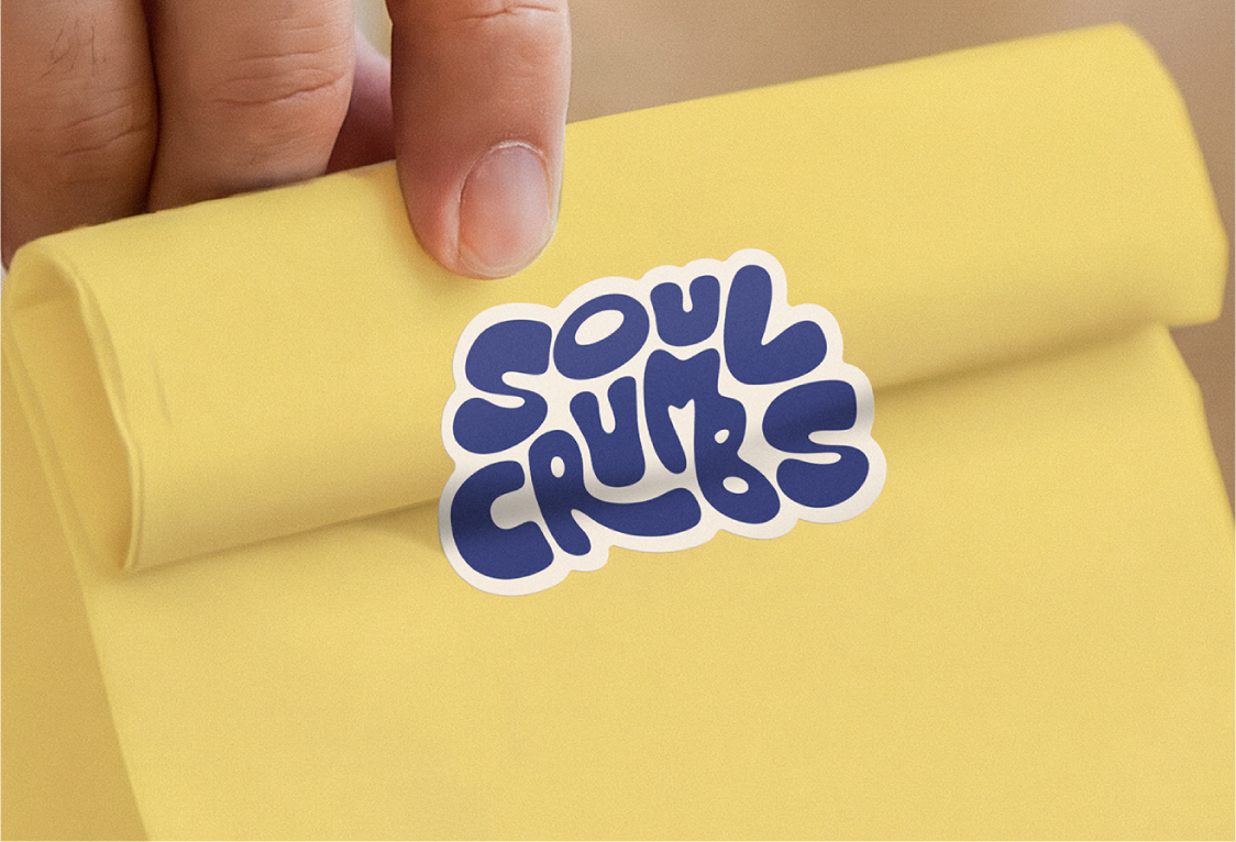
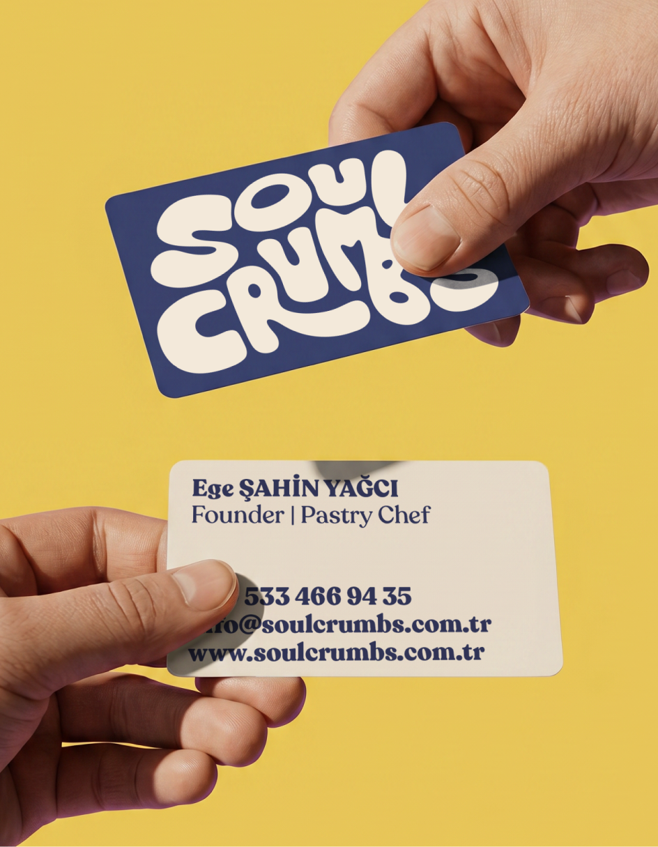

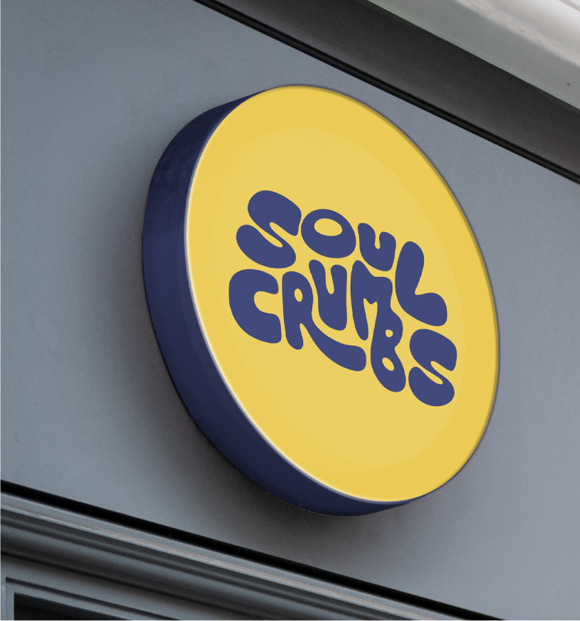
A WORDMARK DRAWN BY HAND SoulCrumbs needed lived-in warmth, the kind from a friend's kitchen, not a luxury patisserie. So I drew the wordmark by hand on an iPad, refining the letters into a single piece of soft display lettering. The forms borrow from late-1960s and 1970s food packaging, when brands still felt human. Drawn rather than typeset, because the brand is too: small, personal, made by one person. A PALETTE PULLED FROM THE KITCHEN Three tones in conversation. A bright yellow: dough, the oven at dawn. A deep navy to ground it and keep it reading warm. A warm cream between them, the colour of unbleached flour. No accents, no fourth tone. A SYSTEM BUILT FOR A SMALL BRAND SoulCrumbs is young and growing, not a chain. I built the identity to match: scalable across bags, boxes, stickers, and signage, with no hundred-page brand book. One wordmark, three colours, one set of forms, small on purpose.